The National Electrical Safety Code (NESC) in Rule 110A1 describes the type of enclosure necessary to surround an electric supply substation. “Rooms and spaces in which electric supply conductors or equipment are installed shall be so arranged with fences, screens, partitions, or walls to form an enclosure as to limit the likelihood of entrance by unauthorized persons or interference by them with equipment inside.” The rule also requires posting of a safety sign at each entrance and one on each side of fenced enclosures. A “NOTE” informs readers that American National Standards Institute (ANSI) standards Z-535.1, .2, .3, .4, and .5 contain information regarding safety signs. You will recall that a “NOTE” used in a rule indicates material provided for information or illustrative purposes only. “NOTES” are not mandatory and are not considered to be part of the code requirements. The standards the NESC is referring to are the 1998 editions of the American National Standards for Safety Signs, Labels, and Tags.
The most recent editions are the 2002 editions. ANSI Z-535 goes into great detail as to what makes up an effective safety sign, label, or tag. You might want to refer back to my November/December 1998 IAEI News article that covered those details. Since the NESC only requires a single safety sign at each entrance and one on each side of a fenced enclosure, I am often asked what more can we do to keep persons out of large high voltage electric supply stations. My recommendation is to comply with the requirements of ANSI Z-535. Section 11.1 of ANSI Z-535.2-2002 states “Signs shall be so placed to alert and inform the viewer in sufficient time to take appropriate evasive actions to avoid the potential harm from the hazard.” Obviously, if a viewer doesn’t see any signs, then they are not properly placed to comply with ANSI Z-535. Installing one safety sign per side can be an effective deterrent for a 30-foot by 30-foot substation. One safety sign per side is not enough for a 500-foot by 500-foot substation. How many are enough? There should be enough signs so that it is obvious to anyone approaching a substation fence from any avenue of approach, that there are WARNING signs on the fence. The legibility of the sign influences the number of signs necessary to meet this goal. The legibility of the signal word WARNING on a safety sign is a function of letter height, letter font, the colors of the letters and background, the angle of the sign relative to the line of sight of the viewer and the general illumination level.
Letter Height
When a sign orientation is 90° to the line of sight of the viewer, well illuminated, and the letter color is in high contrast to the background color, the letter height determines the minimum distance at which the word is legible. By definition, a person with visual acuity of 20/20 is capable of reading letters 0.4 inches tall at a distance of twenty feet. Only about twenty percent of the general population has a visual acuity of 20/20. The minimum visual acuity for driving a motor vehicle in most states is 20/40. Section 9.2.3 of ANSI Z-535.2-2002 specifies a minimum letter height for the letters in a signal word of a facility safety sign to be the viewing distance divided by 150. If the viewing distance is 50 feet, then the signal word letter height should be at least 50 divided by 150 or 1/3 foot (4 inches).
Letter Font
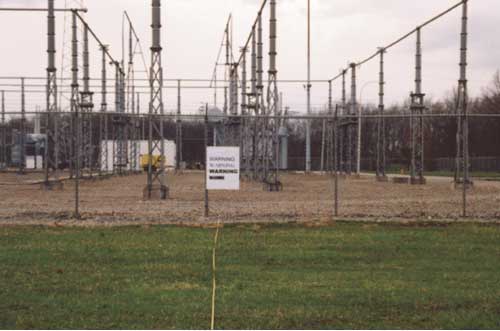
Photo 1. Letter font also has an effect on legibility. Examples of four letter fonts, Arial, C G Omega, Arial Black, and Haettenschweiler, are shown in photo 1.
Letter font also has an effect on legibility. Examples of four letter fonts, Arial, C G Omega, Arial Black, and Haettenschweiler, are shown in photo 1.
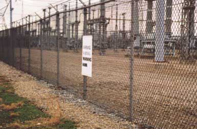
Photo 2. The viewing distance is 87.5 feet. The letters are 3.5 inches in height. The letter font also affects the legibility of a sign when the sign is viewed at an angle. The same sign viewed at a 20° angle and distance of 36 feet is shown in photo 2.
The viewing distance is 87.5 feet. The letters are 3.5 inches in height. The letter font also affects the legibility of a sign when the sign is viewed at an angle. The same sign viewed at a 20° angle and distance of 36 feet is shown in photo 2.
Note that the letters of the Haettenschweiler font smear together making them more difficult to read. Because of the narrow line width, the C G Omega font fades away at angles. Even with fonts like Arial and Arial Black, I recommend the angle between the sign and the line of sight should not be less than 30°. The maximum distance signs should be spaced is a function of minimum viewing angle and clear visibility distance.
Clear Visibility Distance
The significant factor that limits sign spacing is what I call clear visibility distance. Clear visibility distance is the distance at which a person approaching a substation has an unobstructed view of the entire fence he is approaching. If a 50-foot wide strip outside the fence is regularly mowed and kept clear of brush and trees, the clear visibility distance is fifty feet. If that clear area outside area outside the fence is only ten feet wide, the clear visibility distance is 10 feet.
Maximum Sign Spacing
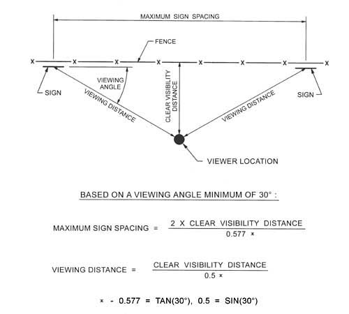
Figure 1. The sign spacing is determined by assuming the worst-case scenario; the viewer approaches the fence halfway between two signs. The relationship between the maximum sign spacing, the minimum viewing angle and the clear visibility distance is show
The sign spacing is determined by assuming the worst-case scenario; the viewer approaches the fence halfway between two signs. The relationship between the maximum sign spacing, the minimum viewing angle and the clear visibility distance is shown in figure 1.
If the clear visibility distance is 50 feet and the viewing angle to 30°, the maximum sign spacing becomes 2 x 50 / 0.577 = 173 feet. That assumes that we will install signs that are visible at a distance of 50 / 0.5 = 100 feet. That would require the signal word “”WARNING”” letter height to be 100 / 150 = 0.66 foot (8 inches). The size of each sign would be about 4 foot by 4 foot. If the clear visibility distance is only 10 feet and the viewing angle to 30°, the maximum sign spacing becomes 2 x 10 / 0.577 = 34.6 feet. The viewing distance becomes 10 / 0.5 = 20 feet. The WARNING letters only have to be 20 / 150 = 0.133 feet (1.6 inches) in height and the size of the sign would be about 1 foot by 1 foot. The signs would be a lot cheaper but you would have to install five times more signs. When the clear visibility distance is only ten feet, the goal can only be met with a lot of signs. When the clear visibility distance is 50 feet, you have a choice of a few large signs, a lot of small signs, or some economical balance between them.








Find Us on Socials