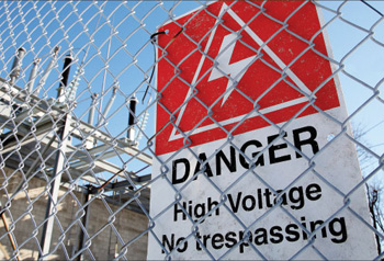
This sign is yet another example of signs that does not effectively warn the public of the hazard. As discussed in detail in Part 2 of this series, this sign should be a WARNING sign. The reader of the sign is outside the fence and is not in immediate danger. The symbol has failed testing many times. It is not one that the general public understands. The sign does not explain the consequences of not avoiding the hazard and it would be more effective if the sign said “Keep Out!” instead of “No Trespassing.”
Keep Out
Whether the hazard is electrical, toxic chemical or a slippery sidewalk, the best way to prevent injury, death, property damage and litigation is to eliminate the hazard. Since eliminating the hazard is often not possible, the second best method is to place physical barriers between the public and the hazard and install effective safety signs to alert the public of the hazard.
In Part 1 of this series I discussed the legal ramifications of not complying with ANSI standard Z535, the American National Standard for safety signs, labels and tags. I also discussed how text font, contrasting colors, letter size, illumination and viewing angle all have a significant impact on sign legibility. These principals apply to all signs including safety signs and menus on the wall of a restaurant.
In Part 2 of this series I discussed how a three panel sign made up of a signal word panel, a message panel and a symbol panel effectively gets the public’s attention, identifies the hazard and the severity of the hazard, informs the public of what actions are necessary to avoid the hazard, and informs the public of the probable consequences of not avoiding the hazard.
Signs having less than three panels
When designing signs that will be read by the general public, it is best to use the three-panel system. However, sometimes the hazard is such that the actions that are necessary to avoid the hazard and the probable consequences of not avoiding the hazard are obvious. In these cases, the use of all three panels may not be necessary to create an effective sign, for example, slippery floor. For this hazard, a simple CAUTION in safety yellow letters on a black background preceded by the safety alert symbol and followed by “Slippery Floor” may be just as effective as a three-panel sign. If the actions that are necessary to avoid the hazard and the probable consequences of not avoiding the hazard are not obvious to all the readers of the sign, the three-panel sign should be used.
Signs directed to qualified employees
In areas only accessible to qualified employees, the safety signs directed toward the employees may not have to be as explanatory as signs directed to the general public. For safety signs used in these areas, the terms used in the signs may be ones only the qualified employees understand. For example, a sign designed to alert employees that the blades of a disconnect switch within a high voltage substation are energized when the switch is open might read:
DANGER
Blades are hot when open
In this example, the reduced wording should only be used if all the employees who might encounter this sign have been trained to know what “Blades are hot when open” means.
Symbol panel only

Photo 1. Skull and crossbones symbol
For some hazards, a safety sign consisting of just a symbol panel may be just as effective as a three-panel sign. This is particularly true in areas only accessible to qualified employees, because we assume they have been trained as to the meaning of the symbols. For example, a safety sign on the side of a five-gallon drum containing a poison may be just as effective with just a skull and crossbones symbol.
If the poison will cause death, the symbol should be displayed in black on a safety orange background (the coloration of a WARNING sign). As long as the drum is not open, the hazard is not immediate. If the poison will make you sick, the symbol should be displayed in safety yellow on a black background (the coloration of a CAUTION sign).

Photo 2. Hand in rollers symbol
A safety sign on the side of a machine having large rollers without a guard (physical barrier) may be just as effective with just a hand in rollers symbol.
In this case the symbol should be displayed in white on a safety red background (the coloration of a DANGER sign) because there is no guard, i.e., the hazard is immediate.
Safety signs designed to alert employees of a company policy relative to safety would normally be a NOTICE sign. Sometimes a symbol panel by itself can be just as effective. For example, in areas where hearing protection is required by company policy, the head with ear protection symbol may be just as effective.

Photo 3. Head with ear protection symbol
In this case the symbol should be displayed in white on safety blue background (the coloration of a NOTICE sign).
In areas where employees are required to wear work gloves by company policy, the two gloves symbol may be just as effective.
Again, the symbol should be displayed in white on safety blue background (the coloration of a NOTICE sign).
For signs designed to prohibit certain activity because of safety, a symbol panel made up of an image in combination with a prohibition symbol (a circle around the image with a slash through the circle) may be just as effective. For example, in an area where flammable liquids are stored, the lighted cigarette prohibition symbol may be just as effective.

Photo 4. Two gloves symbol
In this case the symbol should be displayed in white on a safety red background (the coloration of a DANGER sign) because the hazard is immediate.
Note that the above symbols have a demonstrated understandability through testing.
General Safety Signs
General safety signs used to indicate general instructions relative to safe work practices, reminders of proper safety procedures and location of safety equipment should be written in safety green letters on white background. For example, EYE WASH STATION
Sign design
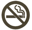
Photo 5. Lighted cigarette prohibition symbol
Just because you have read this series on safety signs does not make you an expert in safety sign design. There is a lot of information in the standards that I have not covered. I have only spoken of environmental and facility safety signs (Z535.2). Some of the requirements for product safety labels (Z535.4) and safety tags and barricade tapes (temporary signs) (Z535.5) are very different from those for environmental and facility signs. I strongly recommend that you purchase all five standards. The design of effective signs that will save lives and hold up in court is not easy. That is why there are many consultants who specialize in the design and testing of safety signs.








Find Us on Socials